Brand Identity
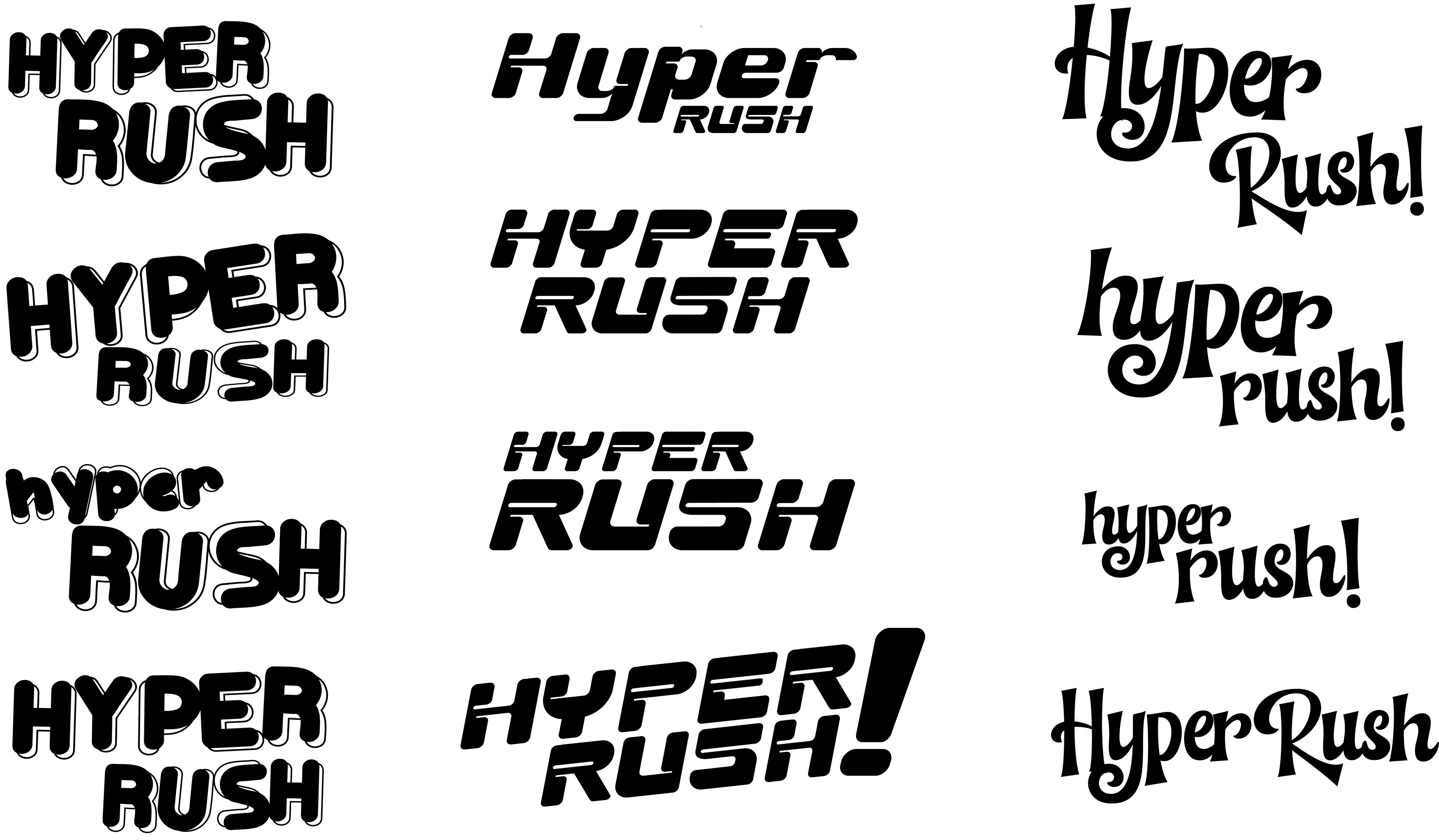
I presented three font directions to the Creative Director: a bubbly candy-inspired style, a sharper type treatment that emphasized the game’s fast-paced “rush,” and a curlier arcade-inspired option. The second direction was selected for its stronger sense of speed, energy, and readability.
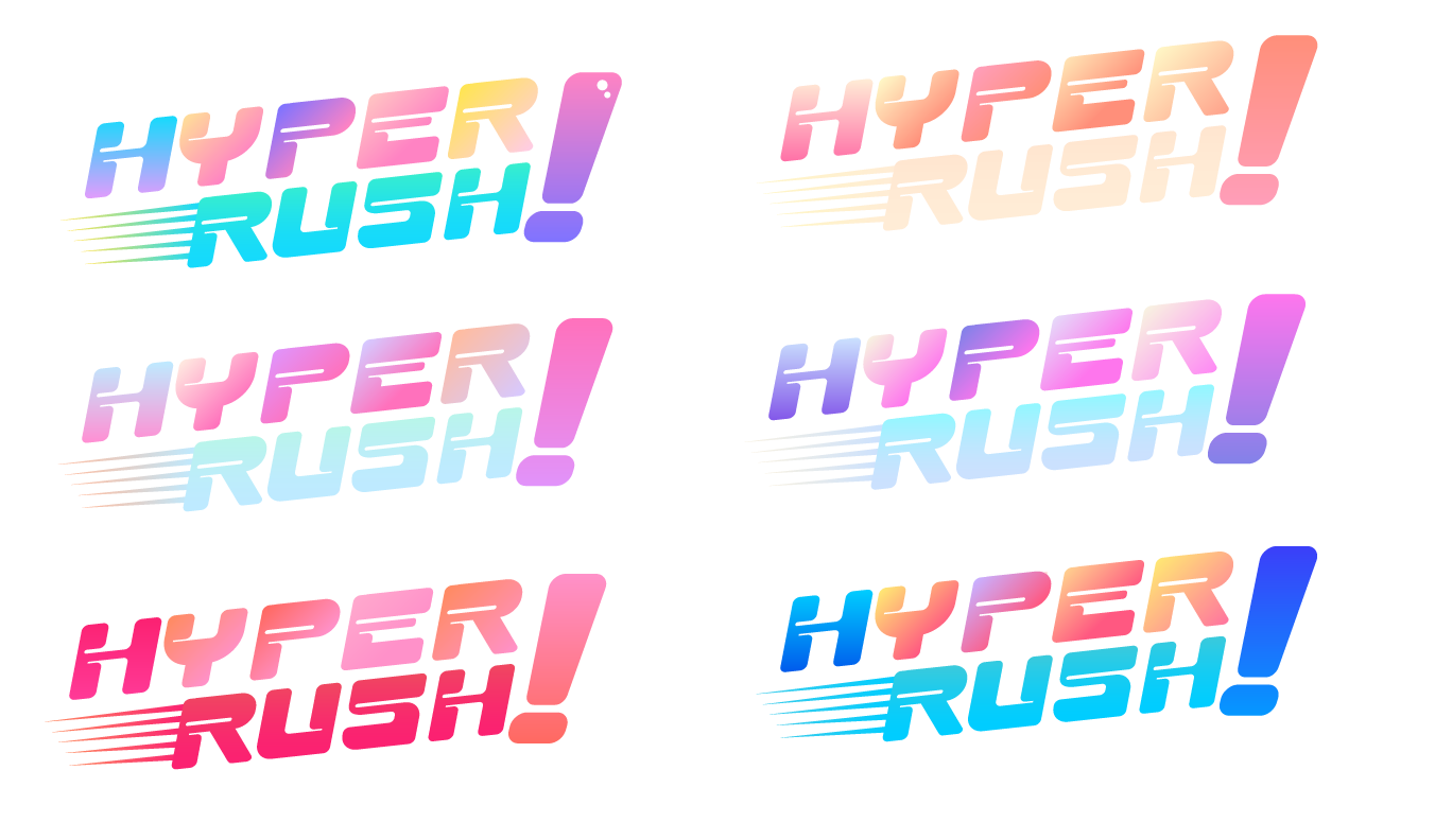
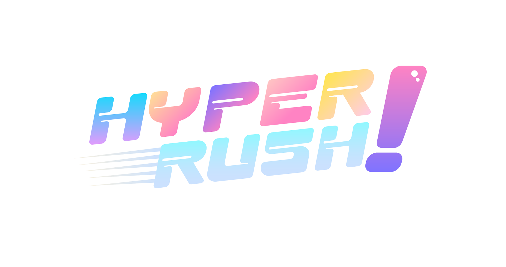
I explored six color palettes ranging from bright candy-inspired combinations to softer dessert-themed options. Since the team was still defining whether the game’s visual identity should lean more towards candy or dessert, presenting these palettes helped clarify the direction. The final palette combined elements from two concepts to create a brighter and more cohesive identity.
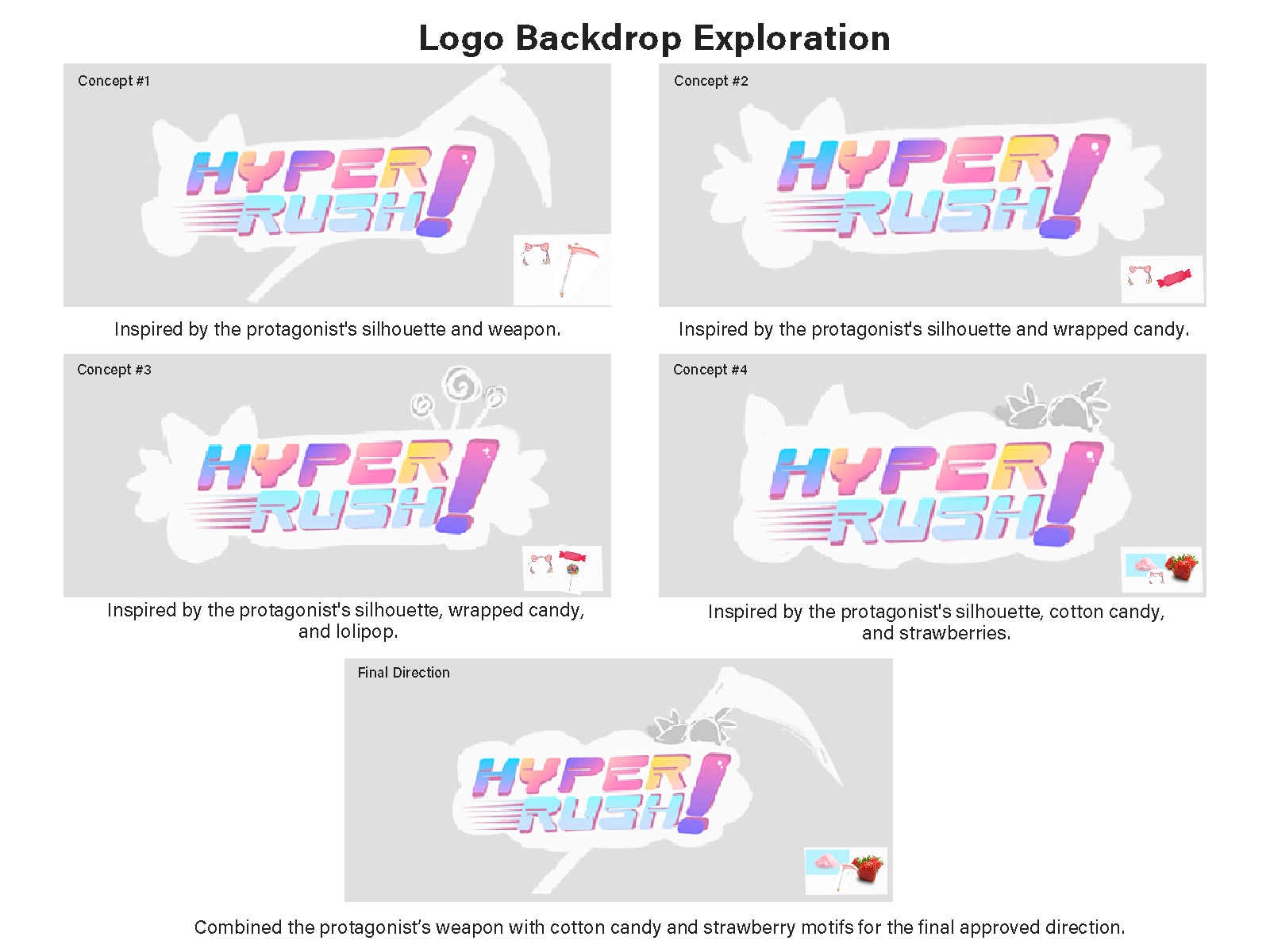
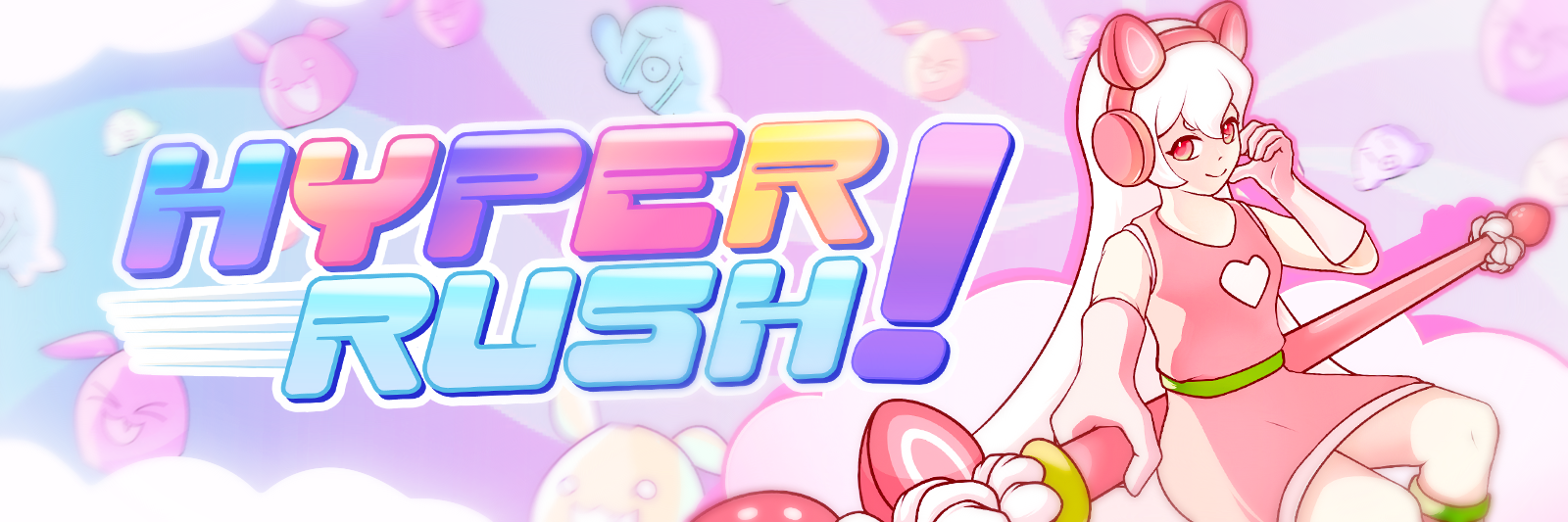
I created five backdrop mockups incorporating key elements of the game and the main character. After presenting them to the Creative Director, we selected a final direction that balanced the character with the world’s visual identity.
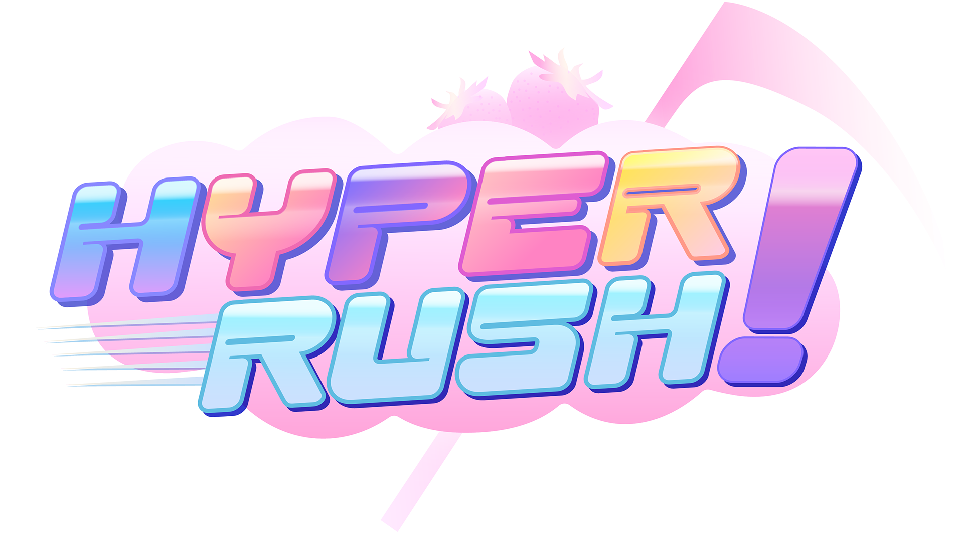
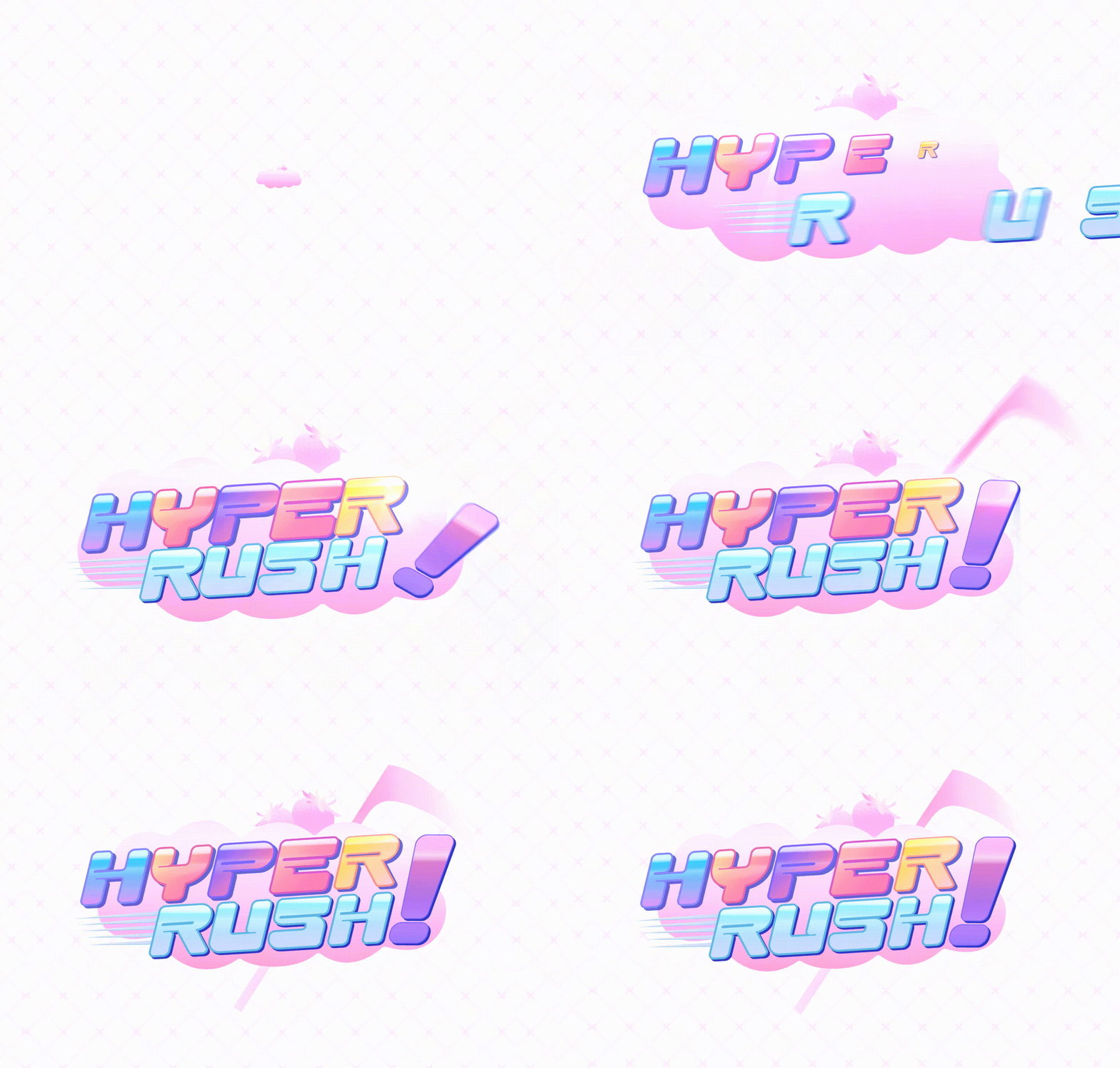
The final design established the game’s overall atmosphere and visual direction. I animated the start screen to create an immediate visual impact and set the tone for the gameplay experience.
After establishing the game’s visual direction through the title screen, I carried that identity into the in-game player interface.
Player Interface
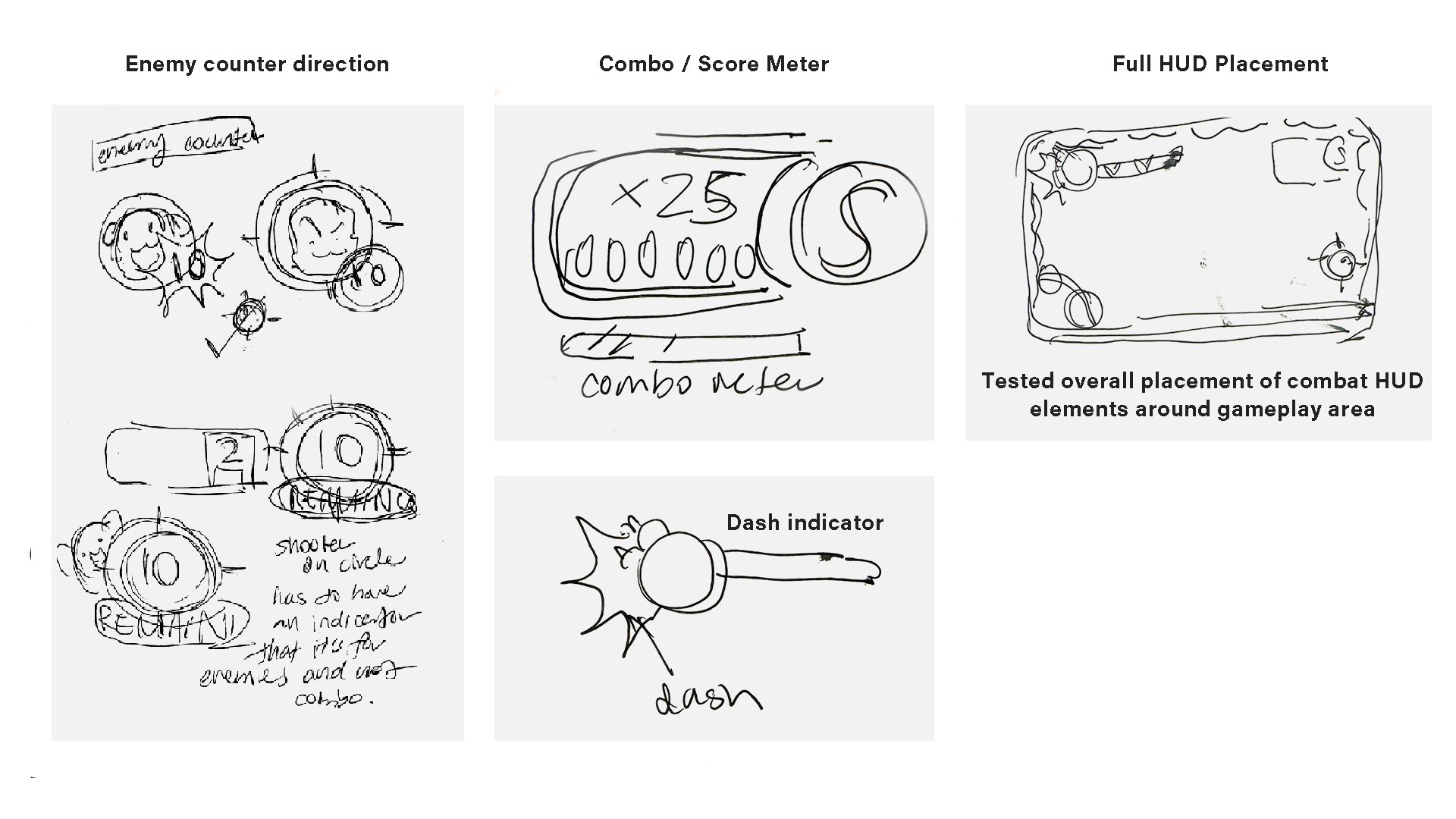
The Problem: The original interface relied on unframed text placed around the screen, making important information such as score, combo, wave progress, and enemy count difficult to read during gameplay.
The Solution: I redesigned the HUD to organize these elements into distinct, readable visual components while keeping them cohesive with the game’s overall identity.
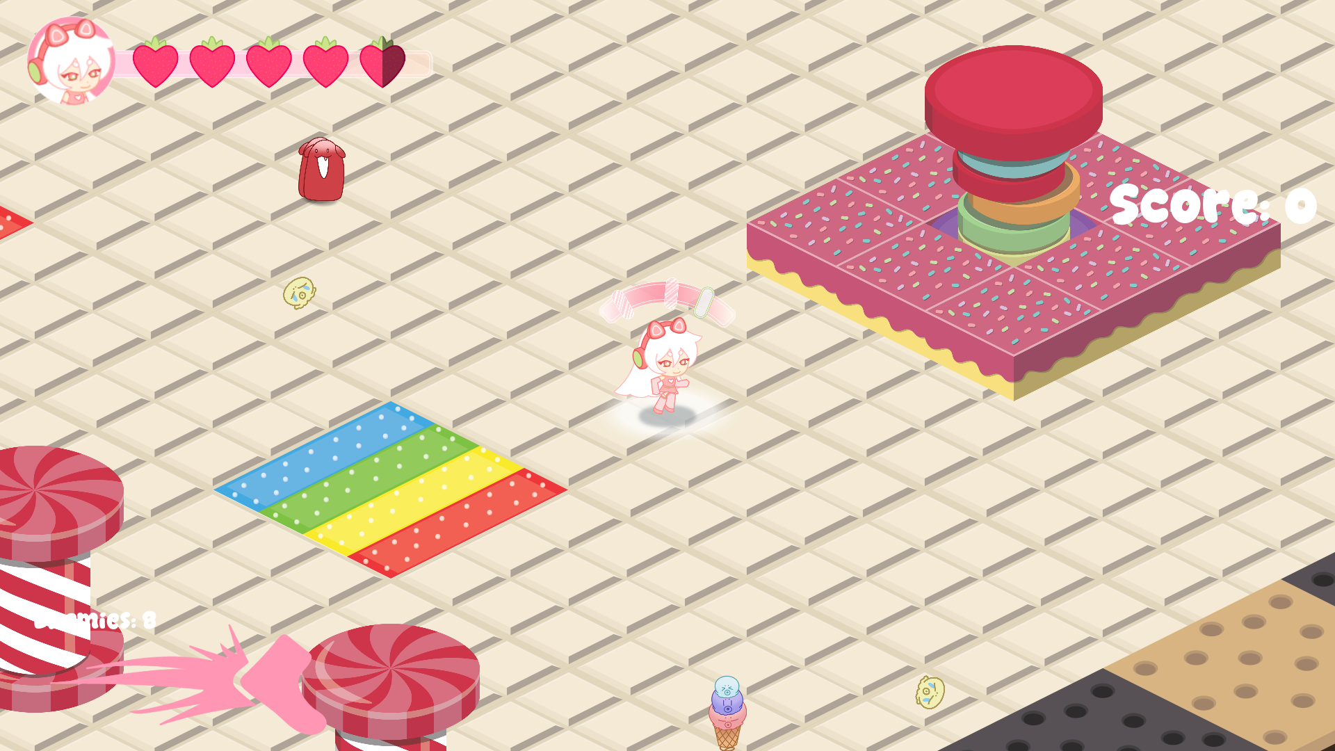
Before HUD Revamp
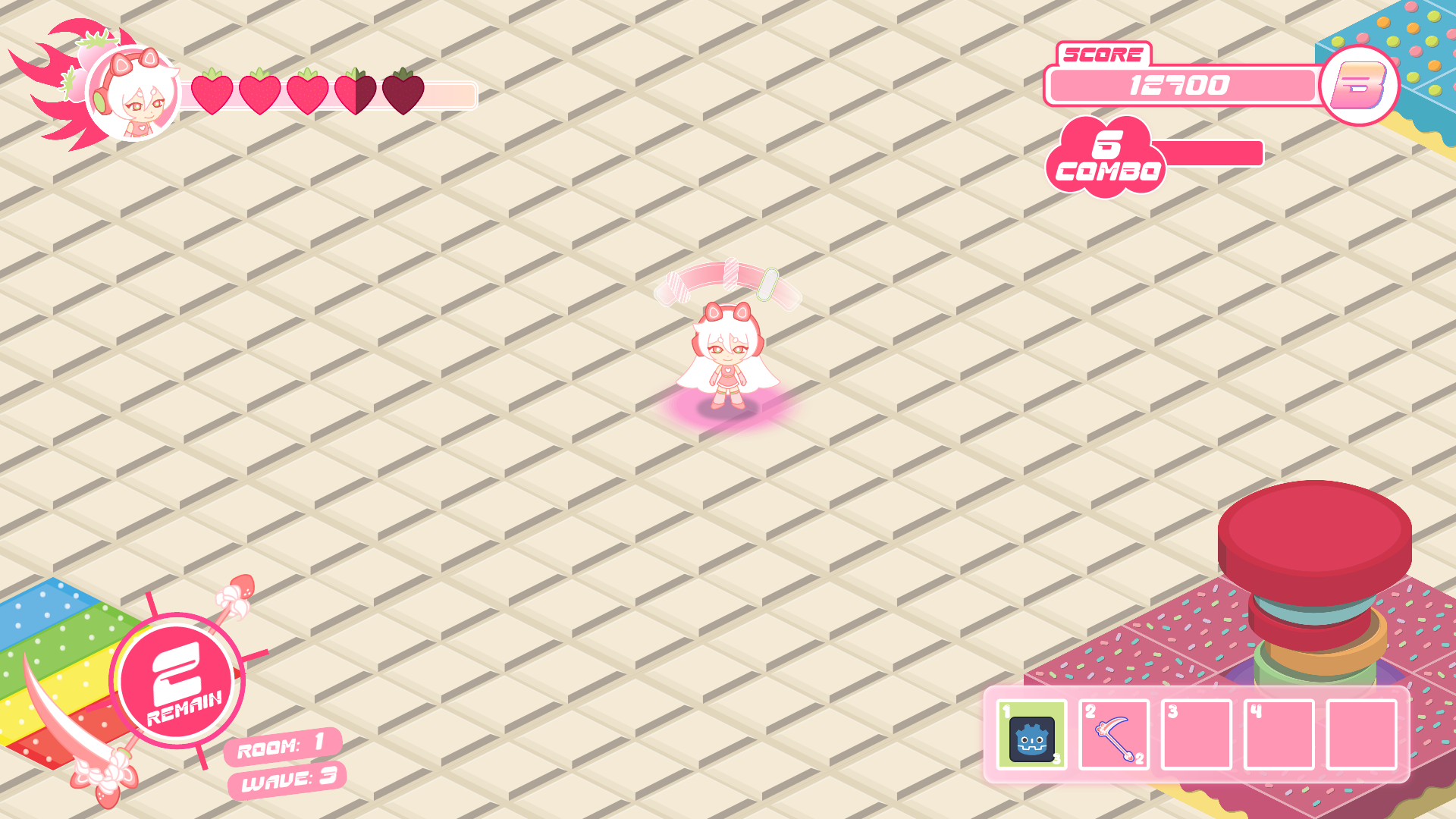
After HUD revamp
Dash Icon
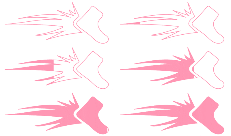
The original dash indicator prioritized aesthetics, but its placement made it difficult for players to monitor during combat. Players had to look away from the action to check both their dash availability and health.
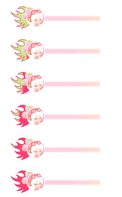
I redesigned the dash bar and integrated it into the base of the player health bar, allowing players to track both systems in one location. I removed the shoe icon and replaced it with a flame-inspired symbol that referenced the original fire-dash concept.
Health Bar
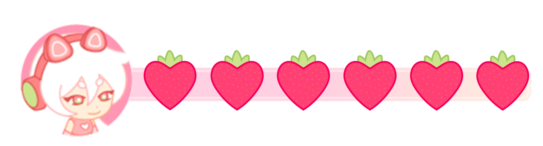
Old HP Bar
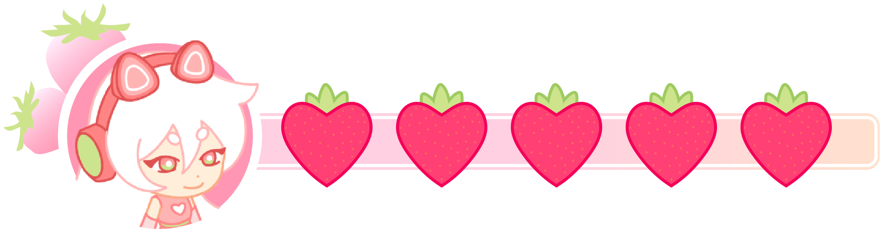
New HP Bar
I modified the health bar to incorporate more character specific motifs. Based on the Creative Director’s concept of strawberry hearts placed over a bar, I used a neutral pink for the base and a deeper pink for the hearts to improve contrast and make the health indicator more visible during gameplay.
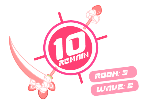
Originally, the creative director wanted to incorporate the scythe asset somewhere in the HUD and suggested placing it in the hotbox. After exploring several layouts, I found that positioning the scythe diagonally across the enemy counter created a stronger and more intuitive visual. Because the base of the wave counter resembles a target, the scythe helps communicate the player’s objective while integrating the asset naturally into the interface.
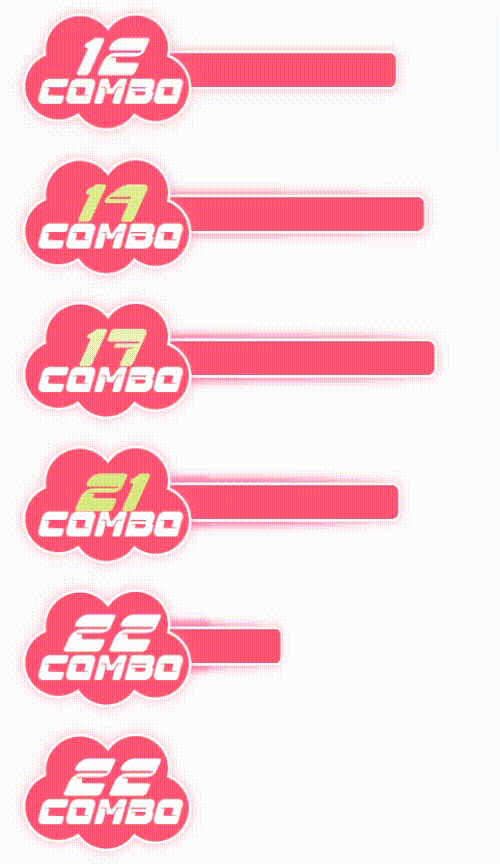
The original combo meter lacked a backdrop, making it difficult for players to notice and track their combo during gameplay. To improve its visibility, I added a stronger background treatment and animated the numbers so they briefly pop whenever the combo increases. I also introduced a progress bar that visually communicates how much time the player has left to attack another enemy before the combo resets.
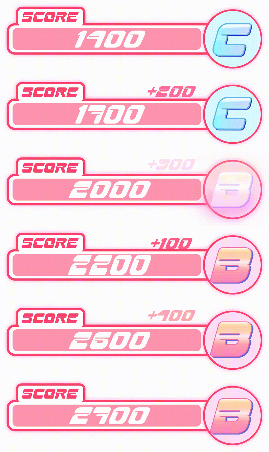
The score bar had a similar visibility issue and needed clearer feedback to help players understand their current score and rank. I added animations to the changing numbers and created a brief visual indicator showing how many points each hit contributes to the total score. These changes make the scoring system feel more responsive while helping players understand how their actions affect their overall performance.